
Before and After Transformations: Heritage to Modern Homes

The most convincing before and after transformations don't begin with paint colours or furniture boards. They begin with constraint. In Britain, that matters more than many homeowners realise because the country's building stock includes a vast protected estate, with 379,443 listed buildings and 9,907 conservation areas in England recorded by Historic England in 2024. A successful transformation has to do more than look dramatic in photographs. It has to solve access, light, planning, heritage sensitivity, storage, energy use and day-to-day family life.
That's the lens worth using in South West London, where handsome period houses often come with awkward layouts, limited side access, tired fabric and strict planning scrutiny. Harper Latter Architects, based in Wimbledon Village, works across the kinds of homes where these tensions are sharpest: Victorian terraces, Edwardian houses, listed properties, basement extensions, bespoke interiors and designed family spaces. Their work is strongest when you read the before and after as a chain of decisions rather than a reveal.
Each example below follows that logic. You'll see the original condition, the client brief, the main obstacle, the most relevant parts of Harper Latter's 8-step process, the architectural interventions, the lived outcome, why it matters locally in Wimbledon and South West London, and the lesson a homeowner can take from it. Alongside that gallery, I've included practical tools for presenting before and after transformations online, from lightweight sliders to WordPress and builder-based options.
Expect paired imagery, concise analysis and practical detail, all in British English.
1. 8 Inspiring Old Homes Renovated In South West London
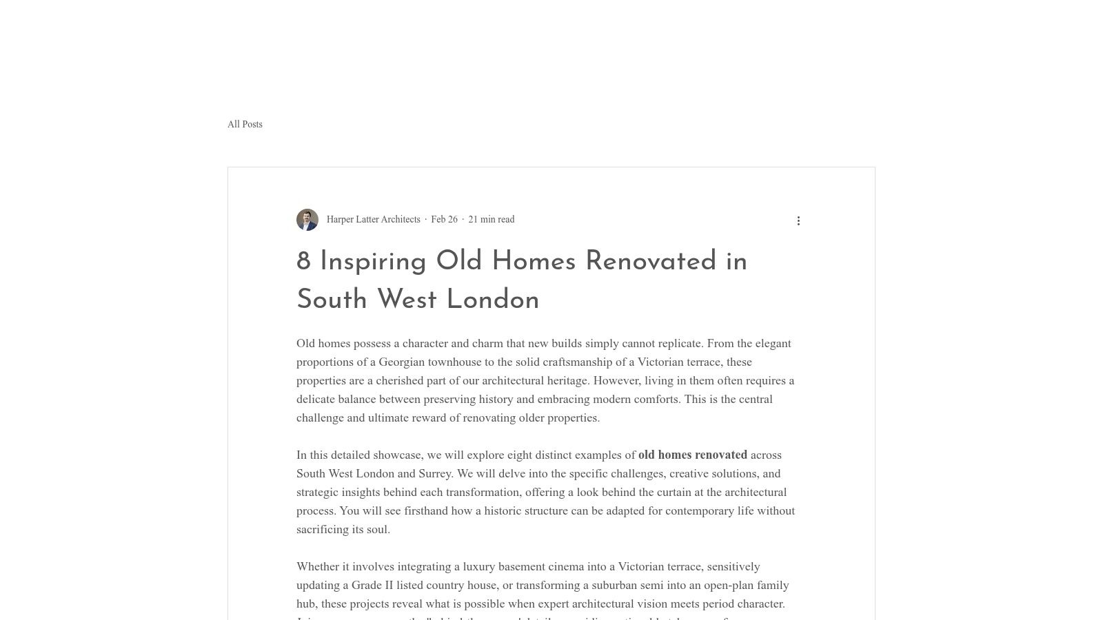
A narrow Victorian terrace in Wimbledon can feel generous from the pavement and pinched once you're inside. A Georgian townhouse in Richmond can look stately but still suffer from dim middle rooms, fragmented circulation and services patched in over decades. That's why Harper Latter's gallery of South West London renovations is useful. It treats old homes as design problems to be reworked carefully, not as backdrops for fashionable finishes.
The strongest thread running through these eight homes is restraint. Period features are kept where they still do useful work. New insertions do the heavy lifting. Bespoke joinery absorbs storage into alcoves and awkward edges. Basement levels become leisure and utility space without asking the principal floors to do everything. Garden rooms and terraces extend family life outward rather than forcing every ambition into the footprint of the existing house.
What the before conditions usually tell you
Across Victorian, Georgian and Edwardian houses, the same starting points recur. Front rooms are formal but underused. Rear spaces are cramped. Natural light drops away in the centre of the plan. Lower-ground areas are often treated as compromise space, even though they can become some of the most valuable square metres in the house when designed properly.
Harper Latter's process matters here because these homes rarely benefit from one bold gesture alone. The early consultation and brief-setting stages establish what has to change first. The concept and planning phases test what's possible under local constraints. Technical design then turns ambition into details that can be built cleanly, from stair geometry and joinery depths to glazing lines and garden thresholds.
Practical rule: Judge a transformation by what became easier to live with, not just by what became nicer to photograph.
A listed or conservation-sensitive project raises the stakes further. Historic England is clear that listed building consent is required for works affecting a listed building's character as a building of special architectural or historic interest. That includes changes that might enhance as well as harm that special interest. For homeowners, that means the design story has to be coherent before drawings go in.
Eight recurring transformation patterns worth noticing
Rather than treat each house as spectacle, read the gallery as eight variations on recurring moves:
Open-plan with discipline: Walls are removed selectively, not indiscriminately, so family spaces connect while entrance rooms and quieter corners retain identity.
Basements with purpose: Lower-ground works often house cinemas, gyms, wine storage or utility zones, freeing the main floors for calmer daily living.
Joinery as architecture: Wardrobes, shelving, stair storage and window seating solve spatial problems without cluttering heritage rooms.
Outdoor rooms that belong: Terraces, designed gardens and garden structures are designed as continuations of the house, not decorative afterthoughts.
The heritage angle is especially relevant in this part of London. Homeowners drawn to heritage building renovation expertise usually need more than style advice. They need someone who can balance conservation, planning and modern use in one scheme.
This gallery does that well. Its main limitation is obvious. These are bespoke, high-end projects rather than low-budget upgrades. But if you own a character house in Wimbledon, Richmond or Chiswick, that's also its value. It shows what happens when before and after transformations are driven by architecture, not just decoration.
2. Knight Lab JuxtaposeJS
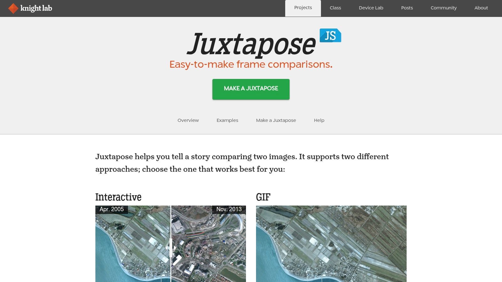
JuxtaposeJS is the cleanest option here if you want the image to do the talking. You place the before image on one side, the after image on the other, add labels, set the starting handle position, and embed the slider. The result feels light and editorial rather than sales-heavy.
That matters for architects and homeowners presenting a sensitive renovation. If the project's story depends on subtle changes, such as a reworked roofline, a restored façade or a carefully inserted rear extension, a heavy plugin can distract from the point. Knight Lab's JuxtaposeJS keeps the focus on the contrast.
Where it fits best
This is a strong choice for custom websites, WordPress sites that don't want another plugin, and Webflow or static sites where a simple embed is enough. It also suits design practices that may later want a developer to self-host the script for more control.
Its strengths are straightforward:
Flexible setup: You can use the hosted builder for a quick embed or move to developer-led implementation later.
Light footprint: It's comparatively lean, which helps when your page already includes large architectural photography.
Clear storytelling: Labels and handle position let you frame the comparison rather than dump two images side by side.
Its drawbacks are equally clear. If you want deeper styling changes or tighter accessibility refinement, someone will need to touch CSS or JavaScript. And if you rely on the hosted route, you're accepting an external dependency.
A good before-and-after slider should disappear once the reader starts dragging it.
For South West London homeowners building a private design brief or architects assembling a project journal, JuxtaposeJS works best when the intervention is legible at one glance. Think façade cleanup, garden restructuring, or a rear elevation transformed by new glazing and better proportion. It's less persuasive when the change is acoustic performance, joinery function or planning strategy. In those cases, the image should sit alongside short captions that explain the move.
3. ZURB TwentyTwenty
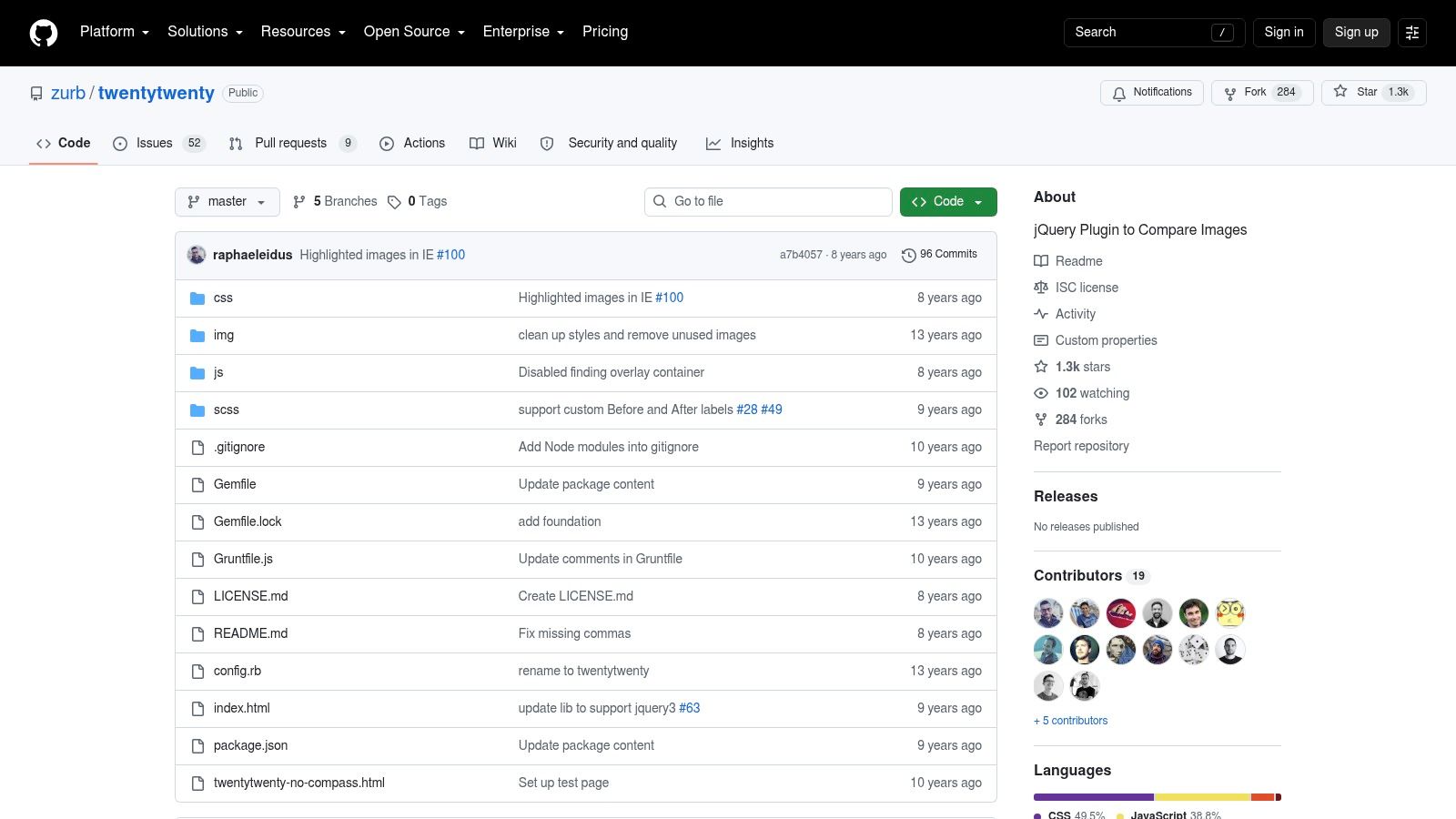
TwentyTwenty feels like the veteran in this list. If your website already runs on jQuery, it gives you a familiar, proven way to create before and after transformations without depending on a hosted service. The plugin is self-hosted, simple to initialise and still useful for firms that prefer direct control over front-end assets.
Its appeal is less about novelty and more about reliability. ZURB's TwentyTwenty repository supports horizontal or vertical comparisons, custom labels and a default offset, which is enough for most renovation galleries.
Why some teams still prefer it
An architect's website often ages in layers. A legacy WordPress theme, an older case-study archive and a web team that values stable tools can all make TwentyTwenty the practical choice. If the site already carries jQuery, adding this plugin won't feel out of step.
A few advantages stand out:
Self-hosted control: You decide where assets live and how they load.
Mature implementation: It's been used widely enough that many developers already know its quirks.
Easy theming: The visual treatment can be adjusted without rebuilding the pattern from scratch.
The obvious trade-off is technical debt. If your site is otherwise modern vanilla JavaScript, adding jQuery purely for an image comparison tool is hard to justify. It also isn't the best option for a non-technical marketing team that wants drag-and-drop editing.
For homeowners comparing architects' portfolios, this kind of tool matters less than the clarity of the underlying project story. Still, the presentation layer shapes perception. A calm, stable comparison slider suits period-house work because it allows the viewer to inspect cornices, brickwork, roof forms or garden edges without gimmicks. TwentyTwenty does that well.
Best used for subtle architectural comparisons
This plugin shines where the difference isn't theatrical. A basement lightwell might be enlarged. A rear elevation might gain stronger symmetry. A side return might alter circulation more than it alters appearance. Those are exactly the kinds of projects where a restrained slider helps the reader slow down and notice what changed.
4. Twenty20 Image Before‑After WordPress Plugin
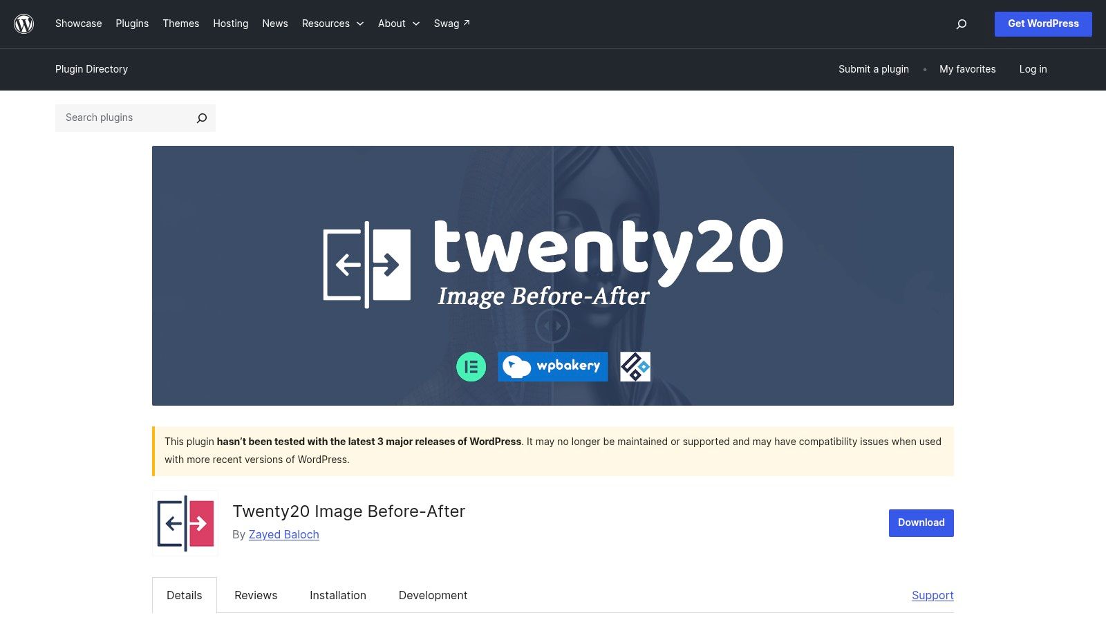
If your site lives entirely inside WordPress and the content team wants to add sliders without developer help, Twenty20 is the easiest fit in this list. It brings the before-and-after pattern directly into the editor, with block and shortcode support that makes rollout across portfolio pages much simpler than a custom script setup.
The Twenty20 plugin on WordPress.org is especially handy when a practice publishes regular case studies and wants a repeatable format. Add images, drop the slider into the page, and the comparison becomes part of the standard publishing workflow.
Why it suits editorial project pages
A strong renovation article usually needs more than a hero image. It needs process sketches, existing conditions, planning constraints, material palettes and finished photography. WordPress editors can build that narrative more quickly if the comparison tool behaves like a native content block rather than an external embed.
Its practical strengths are clear:
Editor-friendly publishing: Gutenberg support lowers the barrier for non-technical teams.
Multiple sliders per page: Useful when one project has several moments worth comparing.
Good for testing: Because it's free, you can try the format across several posts before committing to a more bespoke build.
The trade-offs are familiar to anyone who's managed a WordPress site. Theme conflicts happen. Plugin ecosystems can become brittle. And the output depends on the health of the wider WordPress environment.
Homeowner note: A polished gallery is helpful, but your own renovation brief still needs sequence, permissions and technical detail.
That's where planning discipline comes in. Homeowners who are still shaping scope may find it useful to pair visual inspiration with a more grounded guide to planning a home renovation in the UK. The plugin can show the reveal. The brief still has to explain how the reveal becomes buildable.
A good fit for broad portfolio archives
For South West London practices publishing many project stories, Twenty20 is practical rather than glamorous. It's best when consistency matters more than novelty, and when you want the same comparison format to appear across terraces, listed houses, basement works and garden interventions without custom development each time.
5. Divi Before After Image Module
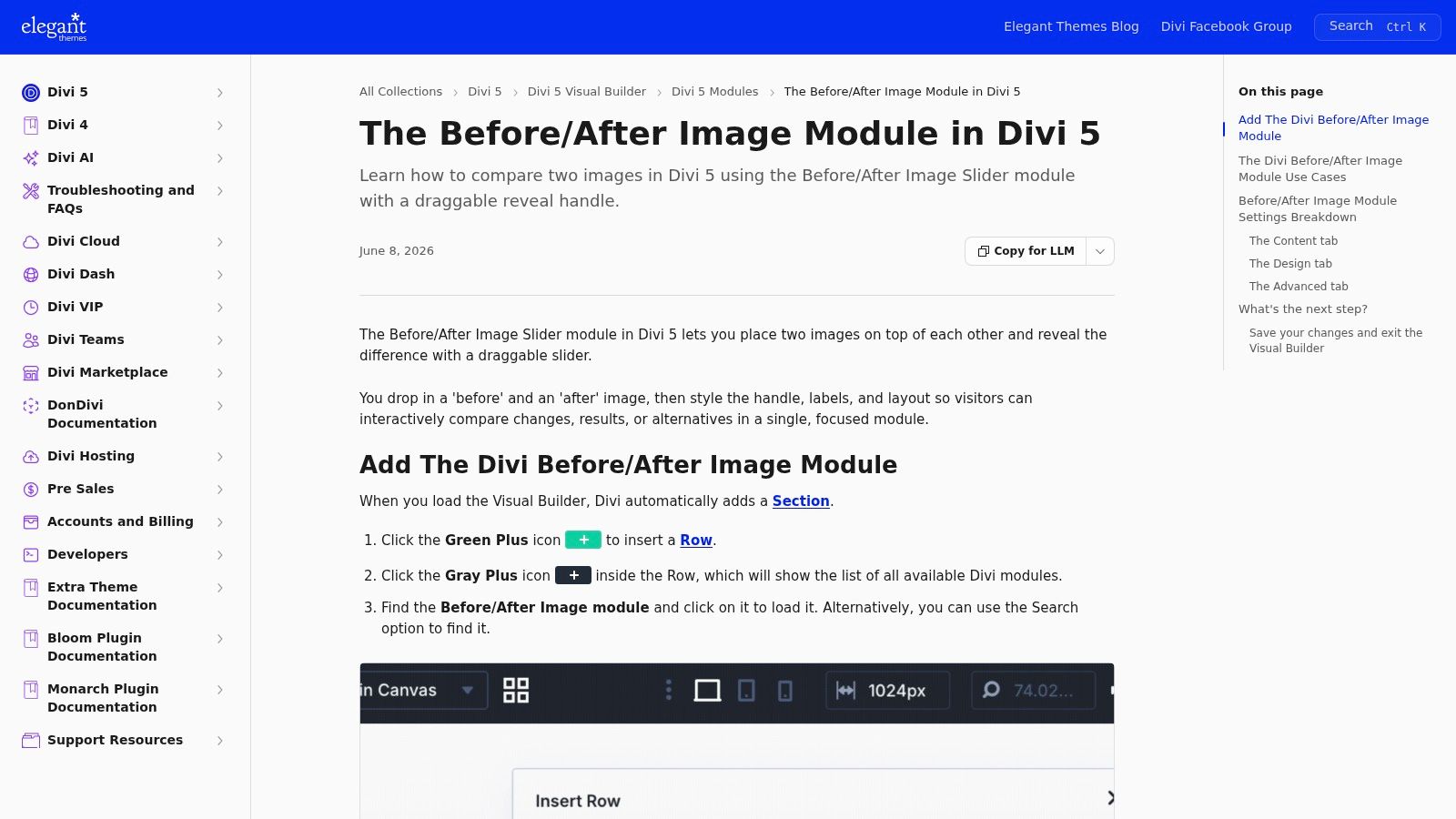
A Wimbledon family scrolling a project page rarely wants a software lesson. They want to see what changed. The cramped rear room became a light-filled kitchen. The awkward stair now reads clearly. The garden threshold finally works. On a Divi 5 site, Divi's Before/After Image module documentation lets that visual evidence sit inside the page builder the team already uses, which often keeps the story clearer and the publishing process calmer.
That matters for a practice gallery built as a chain of before-and-after case studies. A slider can sit beside the short project narrative, the planning constraints, the heritage decisions and the lived result, rather than feeling bolted on as a separate widget. For a studio such as Harper Latter Architects, whose work often depends on measured changes to proportion, circulation and daylight, that tighter fit supports the article's bigger point. The strongest transformations are not only dramatic. They are legible.
Divi is at its best when the website already has an editorial structure. One project page might show the original bottleneck at the side return, then the rebuilt plan with better flow to the garden. Another might compare a tired loft room with a calmer top-floor suite, while the surrounding layout explains insulation upgrades, listed-building sensitivities or how the practice's 8-step process moved the scheme from survey to completion.
Three practical advantages tend to matter most here:
Native design control: Labels, handles, spacing and typography can match the rest of the page without custom styling gymnastics.
Quicker editorial assembly: A marketing assistant or studio manager working inside Divi can place comparisons directly into the project story.
Lower plugin exposure: Fewer add-ons usually means fewer points of friction during updates.
The compromise is clear enough. Divi works well if you have committed to Divi. If the site is rebuilt on another system later, the comparison format is more tied to the builder than a standalone library would be.
There is also a strategic limit. A polished slider can show that a dark Edwardian ground floor became brighter and more coherent. It cannot explain on its own why rooflights were positioned carefully, how original fabric was retained, or what low-energy choices improved comfort after the builders left. The better use of Divi, especially for South West London homeowners collecting ideas, is to treat each slider as one frame in a fuller case study. Show the old condition, show the design response, then show the lived outcome. That sequence turns a visual reveal into something closer to a useful brief.
6. Elfsight Before And After Slider

A Wimbledon practice page goes live before an open studio evening. The team wants one clear visual moment: a gloomy rear extension sliding into a brighter family kitchen, with the island shifted, the ceiling lifted and the garden finally part of the room. No developer sprint, no builder-specific setup, just a publishable comparison that helps a homeowner grasp the change in seconds. Elfsight's Before & After Slider suits that job well.
Its appeal is less about technical purity and more about speed under real studio conditions. A hosted widget lets a marketing lead, studio manager or architect update project stories across different platforms without waiting for custom build work. For a curated Harper Latter Architects gallery, that can be useful at the early storytelling stage, especially when the aim is to test which projects deserve fuller case-study treatment.
That matters because before-and-after imagery rarely stands alone. One slider might show a cramped Edwardian ground floor opened towards the garden. The stronger story sits around it: why the plan changed, which walls were retained, whether heritage constraints limited openings, how insulation or glazing choices improved comfort later. Elfsight handles the fast visual layer. The architectural explanation still needs captions, drawings or a short project narrative that links the design problem to the lived result.
Used carefully, it can support a wider case-study sequence:
A homeowner sees the old condition first. Then the design response. Then the outcome after occupation, whether that is better daylight, easier circulation, lower heating demand or a calmer relationship between old fabric and new insertions.
The trade-offs are straightforward. Free use includes Elfsight branding and view limits, and any hosted script needs checking for page speed, consent handling and long-term dependence on a third party. For practices that want complete front-end control, or for websites built as tightly managed project archives, that constraint may outweigh the convenience.
For South West London homeowners, the lesson is simple. Use a tool like this to compare visible change quickly across kitchens, façades or garden rooms. Then look for the deeper layer a good architect should supply: the brief, the planning or conservation response, the material choices, and the measured outcome that proves the transformation was more than cosmetic.
7. Crocoblock JetElements Image Comparison
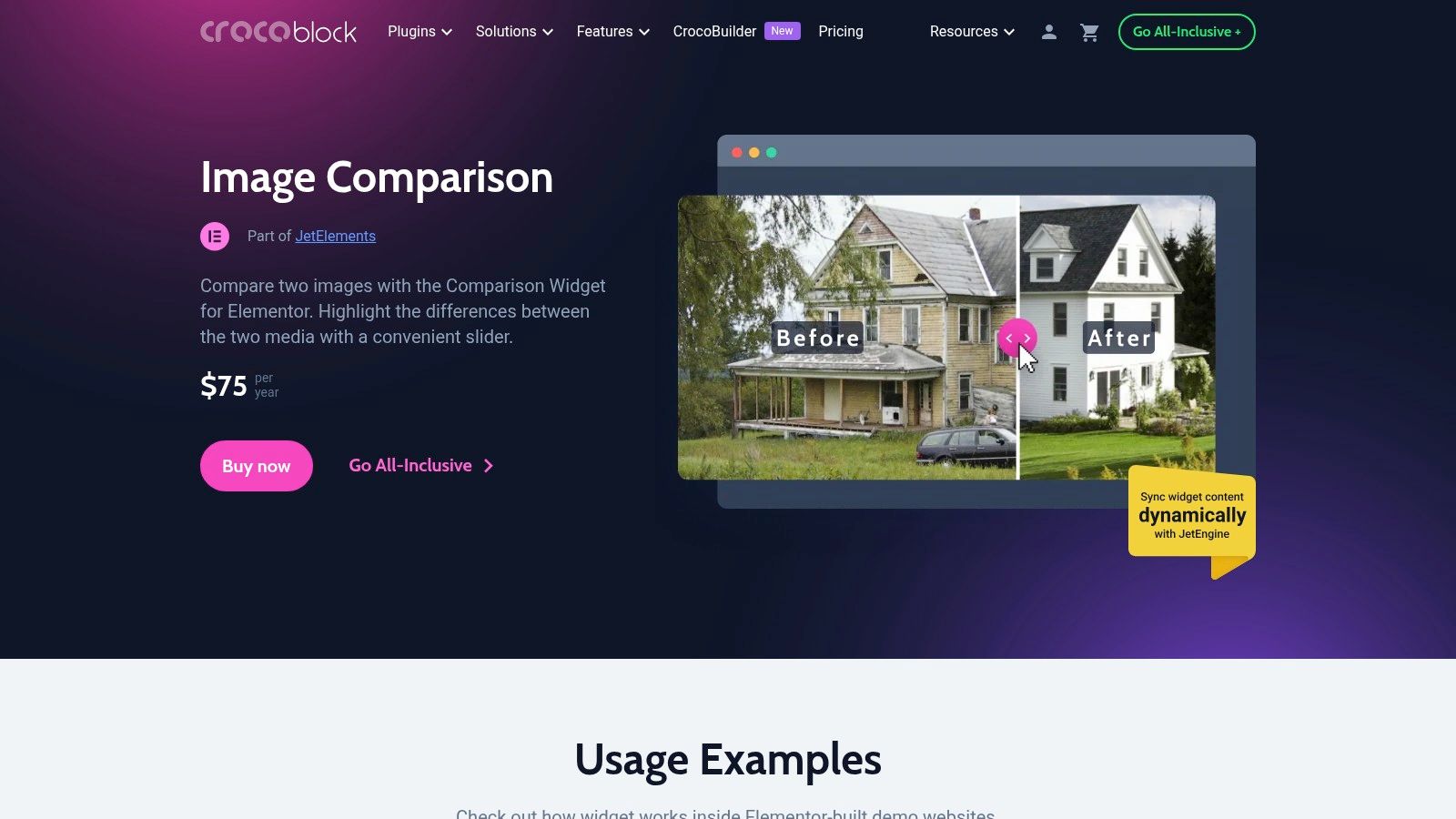
A Wimbledon practice publishes one renovation a month. By year three, the gallery is crowded with Victorian rear extensions, listed façades, loft conversions and carefully reworked Edwardian plans. The challenge is no longer getting one before-and-after slider online. It is keeping every project legible, searchable and consistent as the archive grows.
That is where Crocoblock's Image Comparison widget earns its place. On an Elementor site built around custom post types and fields, the comparison images can be tied to structured project data instead of added by hand each time. A gallery then starts to work like a proper case-study library, with projects sorted by location, building age, heritage status or scope of works.
For a curated Harper Latter Architects-style gallery, that matters. The before image can sit alongside the original design constraint. A narrow side return. A protected frontage. Poor thermal performance in the old envelope. The after image then has context: what changed in the plan, which parts of the existing fabric were kept, how the 8-step process moved from survey and brief to planning, technical design and completion, and what the homeowners gained in daily use.
JetElements suits that editorial approach because the structure sits behind the visuals. A team can build one project template and repeat it across many homes, pulling in the comparison image, short narrative, material notes and outcome fields automatically. For South West London homeowners, that makes patterns easier to read. You can compare how one practice handles conservation limits in Wimbledon Village versus daylight problems in a deeper terrace near Raynes Park, without every page feeling improvised.
The limits are practical. It only makes sense for Elementor sites, and the cost is easier to justify for a practice maintaining a growing portfolio than for a one-off blog post.
Used well, JetElements does more than show a polished reveal. It helps a renovation archive explain why the transformation worked, what it asked of the old building, and which lessons a homeowner can carry into a better brief of their own.
7-Way Before-and-After Comparison
Option | 🔄 Implementation complexity | ⚡ Resource requirements | ⭐ Expected quality/outcomes | 📊 Ideal use cases | 💡 Quick tip |
|---|---|---|---|---|---|
8 Inspiring Old Homes Renovated In South West London | N/A, editorial/portfolio piece (no technical setup) | Low, images and copy only | High, demonstrates bespoke, high-end outcomes (⭐⭐⭐) | Showcasing firm expertise; inspiring heritage homeowners | Use strong before/after visuals and note region/budget constraints |
Knight Lab, JuxtaposeJS | Low–Medium, embed builder or include JS API | Very low, lightweight CDN/npm or self-host | Good, clean, responsive comparison slider (⭐⭐) | Lightweight, CMS-agnostic sites; quick embeds | Self-host to avoid external CDN; add CSS/ARIA for accessibility |
ZURB, TwentyTwenty | Medium, include JS/CSS and initialize (requires jQuery) | Medium, jQuery dependency adds weight | Reliable, mature, themable library (⭐⭐) | Sites already loading jQuery (many WP themes); self-hosted control | Best in jQuery projects; serve minified assets to reduce impact |
Twenty20 Image Before‑After (WP plugin) | Low, install plugin; use Gutenberg block or shortcode | Low on WP sites, plugin + images | Good, editor-friendly, multiple sliders (⭐⭐) | WordPress sites where editors need no-code blocks | Test for theme/plugin conflicts before site-wide rollout |
Divi, Before/After Module (Divi 5) | Very low for Divi users, drag‑and‑drop module | Medium, requires Divi subscription | High within Divi ecosystem, native styling/support (⭐⭐⭐) | Sites standardized on Divi; marketing/content teams | Use built-in responsive controls; not portable off Divi |
Elfsight, Before & After Slider | Very low, hosted, no-code widget (embed) | Low to medium, external script; paid tiers for branding removal | Good, fast deployment; vendor-managed (⭐⭐) | Non-technical editors; multi-platform quick rollouts | Consider cookie consent and branding limits on free plan |
Crocoblock (JetElements), Image Comparison | Medium, install JetElements/Elementor and configure widget | Medium, commercial plugin; requires Elementor (and JetEngine for dynamic) | High, robust styling and dynamic content support (⭐⭐⭐) | Elementor sites needing dynamic/custom-field-driven comparisons | Budget for license; ensure JetEngine compatibility for dynamic images |
Turn Inspiration into a Better Brief
The useful lesson in before and after transformations isn't that anything can be changed. It's that the right things can be changed in the right order. A clear survey of the existing house comes first. Light, circulation, storage, structure, heritage significance, garden relationship and services all need to be understood before the design starts chasing visual effect.
That's especially true in South West London, where ambition often runs into planning and conservation reality. Heritage work is a large and active part of the national picture, and listed building consent is only one part of the wider compliance framework. Public data now records 897,335 listed building consent applications, which is a reminder that protected-building work is not unusual, but it is procedural. Homeowners need guidance on what can change, what should stay, and what might trigger approval issues later.
Sustainability belongs in that early brief too. A transformation that only photographs well is incomplete. In one UK deep-retrofit demonstration on 11 dwellings in Sutton and Nottingham, mean heat loss fell by 33 W/K, equal to a 21% reduction, while average annual heating bills dropped from £926 before retrofit to £725 after retrofit including PV. That doesn't mean every project will perform the same way, but it does show why fabric, detailing and systems deserve a place in the before-and-after conversation.
Better renovation briefs ask how a house should work after the transformation, not just how it should look.
The same principle applies to local planning constraints. Basement ambition, for example, has to be tested carefully in London boroughs. The Greater London Authority states that boroughs should address the negative impacts of large-scale basement development and that the Mayor supports restricting excavations where they are likely to cause unacceptable harm. Borough-level rules can then become more specific. In Kensington and Chelsea, policy says basement development must not exceed 50% of each garden or open part of the site, must not comprise more than one storey, and must not add further basement floors where one already exists. Lambeth's Local Plan adds its own constraints on groundwater, slope stability, flooding, tree health and the general expectation that rear garden area remains substantially free of subterranean development. The detail varies by borough, but the lesson doesn't. Feasibility comes before fantasy.
For homeowners in Wimbledon, South West London and Surrey, the most productive first step is to compare your own property against the patterns in these case studies. Where is the plan failing? What part of the house is underperforming? Which original elements add value? Where might a new intervention improve family life without fighting the character of the building?
Bring those questions into the first consultation. Bring photographs of problem areas, a rough wish list, any old planning paperwork, and a sense of which outcomes matter most. That's how inspiration becomes a workable brief.
Harper Latter Architects designs bespoke home transformations across Wimbledon, South West London and Surrey, including heritage renovations, basement extensions, interior architecture and family spaces designed around outdoor living. If these before and after transformations have sharpened your own brief, visit Harper Latter Architects to explore their work and start a conversation about what your property could become.
Comments